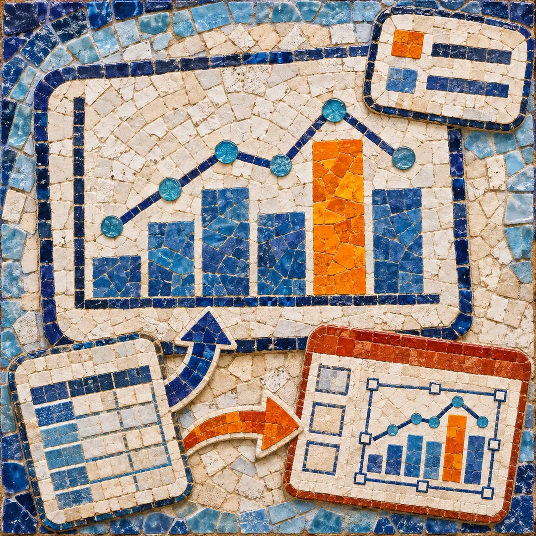
Make a chart with AI
Turn a labelled dataset into a branded chart or diagram. Check units, axis baselines and relationships before exporting a PNG or SVG for your report.
To make a chart with AI, decide what the reader should be able to compare. For a report on workshop attendance, that could be the number of bookings each month or how many people returned for a second session. The local data-viz renderer builds the figure from a typed table and a specification of the transformations you want.
The renderer checks that a bar starts at zero, that a value axis uses one unit and that shares add up when you describe them as parts of a whole. A styling change to a diagram can also keep its original arrows and labels fixed. You still need to look at the finished image at its intended size.
What it does
- Compare categories with one highlighted bar and a short annotation.
- Show a trend across weeks while drawing attention to one series.
- Display the distribution of measurements in a histogram.
- Export a vector copy for a slide and a PNG for a report.
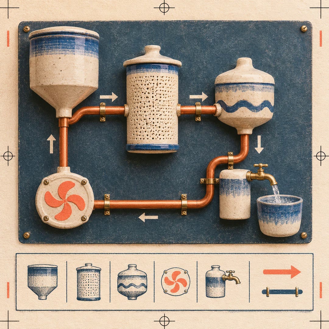
- Preserve the direction of every connection while restyling a process diagram.
Install and use
- Install the skill in an assistant with the local Node rendering tools and your brand pack. An already configured renderer takes a chart specification without a model key. Diagrams also need D2.
- Provide the values, field names, units and intended dimensions. Identify estimates or values transcribed from a screenshot.
- Inspect the rendered figure at reading size and compare its labels and values with the source table.
FAQ
Source
Made by LangChain. Original skill: data-viz, published on GitHub under the Apache-2.0 licence.
View on GitHubRelated products
- SkillNew
Create SVG charts with AI
Choose a chart around the finding, record its data once and generate an inline SVG. An optional route turns that same specification into editable PowerPoint shapes.
Free - SkillNew
Technical SVG diagrams with AI
Organise nodes, connections and legends in a self-contained technical diagram
Free - SkillNew
Create draw.io diagrams with AI
Create editable process and relationship diagrams, validate their XML and optionally convert Mermaid into documentation images that retain an editable source.
Free