Make a chart from Excel with AI
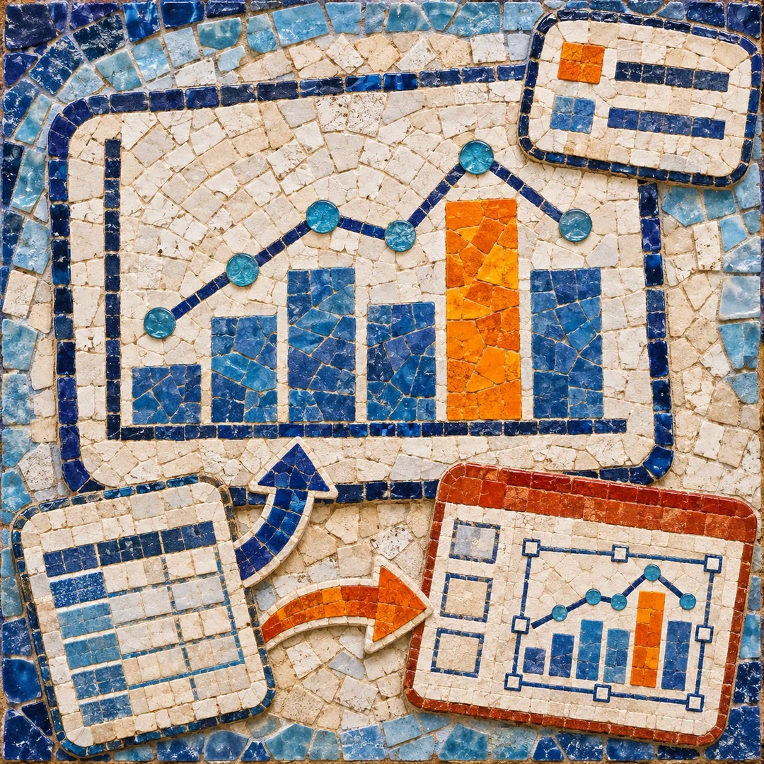
Choose a chart for your question, generate it in Python and keep the figure and plotting code for the next reporting cycle.
To make a chart from Excel with AI, decide what the reader should notice. A line can reveal seasonal movement in monthly orders. A sorted bar chart makes it easier to compare several product ranges at one point in time. With create-viz, the agent can prepare the data, explain its chart choice and supply the code behind the figure.
Consider how the chart will be used. A slide viewed from across a room needs larger labels than a chart being inspected on a laptop. Include the unit and say how missing months should appear. A missing observation and a genuine zero tell different stories.
What it does
- Plot a time series from a workbook
- Rank categories with horizontal bars
- Explore the spread of values in a histogram
- Create an interactive chart with hover details
- Save a static figure and reuse its plotting code
Install and use
- Install the skill in an agent with a Python environment, pandas and Matplotlib or Seaborn. Plotly is needed for interactive charts. Supply an authorised table.
- Ask “Plot monthly orders from this workbook for a team presentation. Label the axis in orders and show where a month is missing.”
- Check sample points against the source table and view the saved figure at the size your audience will see.
FAQ
Source
Made by Anthropic. Original skill: create-viz, published on GitHub under the Apache-2.0 licence.
View on GitHubRelated products
- SkillNew
Create SVG charts with AI
Choose a chart around the finding, record its data once and generate an inline SVG. An optional route turns that same specification into editable PowerPoint shapes.
Free - SkillNew
Technical SVG diagrams with AI
Organise nodes, connections and legends in a self-contained technical diagram
Free - SkillNew
Create draw.io diagrams with AI
Create editable process and relationship diagrams, validate their XML and optionally convert Mermaid into documentation images that retain an editable source.
Free